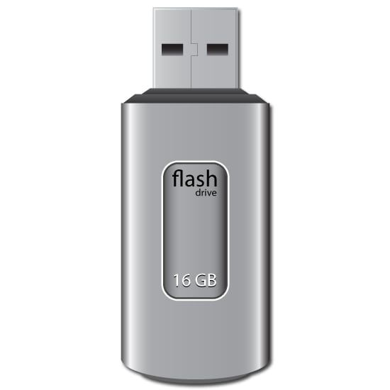

This is a guest post by Ubiratan Cunha in this Adobe Illustrator tutorial he will show us how to create a realistic pendrive only using shapes and gradients. Observation to details like lights and shades can make all the difference. Hope you enjoy it!


Step


Create a new document the size you want (I set my document to 550 x 550 px).
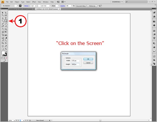
Pick up the Rectangle Tool (M) and click anywhere on the page. In the dialog box input the values 175 px for width and 300 px for height.


Step


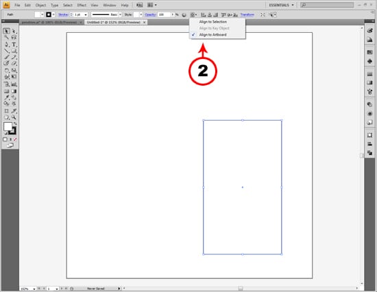
Let´s align our rectangle to the center of the page. Select the rectangle we just created and click on the button beside the align controls, on the top of the page. Select the “Align to Artboard” option. Now clik the buttons “Horizontal Align Center” and “Vertical Align Center”.


Step
Now that our rectangle is centered, let´s create the bottom part of our image. To do this, select the Ellipse Tool (L) and click anywhere on the screen. A dialog box will appear. Set width to 175 px and height to 50 px.
Step
Let´s align the ellipse to the rectangle. To help us do this, go to View and select the option Smart Guides to enable them.
Step
Now, using the Selection Tool (V), drag the ellipse to the bottom of the rectangle until you see 2 green smart guides indicating the ellipse is alligned in the bottom center. See the image bellow.
Step
OK, now select both shapes and using “Pathfinder”, unite them.
Step
Now let´s use some gradient to fill our shape. Select our shape, open the gradient window and apply the gradient to the shape. Now follow this steps to setup the gradient correctly:
Fisrt of all, add 6 stops to the gradient, and setup one by one following these instructions:
Set the first stop to 82% black and location 30%, like the image below:
The same way, set the other stops using this values:
2º Stop: 2% black, location 6%
3º Stop: 40% black, location 22%
4º Stop: 45% black, location 75%
5º Stop: 10% black, location 93%
6º Stop: 100% black, location 100%
Finally, set this two sliders this way:
Step
Now set the stroke to none and using the Rectangle Tool, draw two more rectangles. The first should be 158 x 12 px and the second 118 x 8 px.
Step
Now, let´s apply some effect. Select the first rectangle, go to Effects > Warp > Arc…. Set the vertical distorsion to 10%. Do the same with the other rectangle.
Step
Now apply a gradient with 95% to 80% black with 90º to both shapes. After that, align them to the center of the page and behinde the pendrive body as shown bellow.
Step
Alright, now using the Rectangle Tool, make 3 squares:
- 100 x 100 px. Fill it using a gradient following the parameters described in the “First gradient” image
- 97 x 97 px. Fill it using a gradient like described in the “Second gradient” image
- 94 x 94 px. Fill it using a gradient like described in the “First gradient” image
Step
Select the 3 squares and click Horizontal Align Center and Vertical Align Center. After that, send them behind the other elements on screen and in the position presented below.
Step
Let’s add some details to our pendrive. Draw 2 little rectanles about 25 x 14 px and fill them with a gradient (see the image below).
Set the position of the rectangles following the image. Now, using the Pen Tool draw a line between the two rectangles the same way you see in the image. Set the stroke to 0,25. Finally, create a ellipse with 135 x 35 px, with 70% black for fill and set it behind the object body.
Step
Now, using the Rounded Rectangle Tool create a shape with 80 px for width, 165 px for height and Corner Radius of 20 px. Set the fill color to white and center it on the screen.
Step
With the Selection Tool, select the Rounded Rectangle and go to Object > Path > Offset Path. When the dialog box open input -3 px in the Offset field.
Step
Select the smaller rectangle that we just created and apply to it a gradient following the instructions in the image bellow.
Conclusion
To finish our work, add a stroke of 2px 80% black to the smaller rectangle and add some text on top of it like the image bellow. Now our pendrive is finished!!!!
Here it is!!! Hope you enjoy!
I like to thank Ubiratan for producing this cool Adobe Illustrator tutorial and i hope that you guys learned some new skills reading this tut because we at TUTORIALBOARD.NET BELIEVE THAT YOU’VE GOT TO KNOW MORE!
Please leave your comments for anything related to this tutorial. Also make sure you Subscribe to our Feed or Follow Me on Twitter to stay updated to the lattes tutorials, news and interviews in the graphic community.
Are playing Bitmangos Word Cookies game, make sure you check our spoiler free word cookies answers game cheats.
Follow the links below for Cookie Clicker tips & hacks.
For more tutorials and game cheats head over to the main page.
View Comments (47)
-
Cancel reply -
Cancel reply -
Cancel reply -
Cancel reply -
Cancel reply -
Cancel reply -
Cancel reply -
Cancel reply -
Cancel reply -
Cancel reply -
Cancel reply -
Cancel reply -
Cancel reply -
Cancel reply -
Cancel reply -
Cancel reply -
Cancel reply -
Cancel reply -
Cancel reply -
Cancel reply
« Previous 1 2 3 Next »Awsome tutorial very specific i had much fun doing it
thanks
really it's really good i like it. work is tremendous
Nice Idea, I have never thought like that.
Good work.
@Adrian....thanks for pointing that out .. :)
Hey, Nice tutorial but on step 16 the 2nd stop should also be 45% black not 80.
i will try this also. thank you for sharing this tutorial
cool tutorial, it got a little complicated at the end but cool overall
thanks this adobe illustrator tutorial was a real help for me :)
very helpful posts
thanks for publishing a very cool illustrator tutorial.
great tutorial....hope to see more....
Very nice Illustrator tutorial indeed...
Frank06
from Berlin
Waooo, you’re the best…
Thank you, so much
Very good !!!! I like it so much!!
TB rules...awesome tutorial...
This tutorial looks really cool. I will try it out tomorrow and let you know how it goes....
great piece...congratulations, really very good contribution
Yeah......its a nice tutorial, thanks.
Beatifull!
Congratulation
Nice tutorial...what more can i say...
Simple and beautiful, thanks for sharing.